


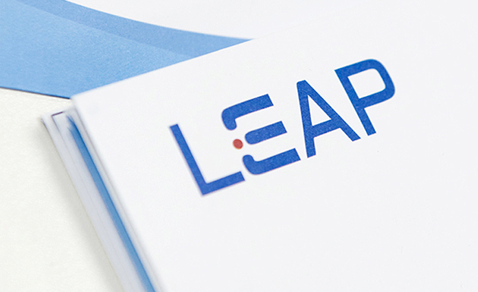
LEAP, simple letter combination reflects the high level of international horizon. With the sky-blue matching color, the generosity of the brand is accurately reflected. In the logo with a red dot, the three-in-one high quality service is represented. The effective connection among candidate, client and consultant and return to simplicity is the hub, concentration and origin.
Be the market leader, lead the development of recruitment market, become the first choice of client.
Be the pioneer of quick response, give priority to efficiency and take the lead in the industry.
Be the model of accurate searching, save time and make it more accurate and effective.
Be an observant leader, have particular perspective and develops new way of the cognition in the industry.
